 |
| Add2Paper's Website |
Our purpose is to discover the level of interest in the American student market and, in particular, the level of interest by individual university.
To accomplish this goal, we need to explain to students exactly what we do in a clear and interesting fashion.
To that end, I have been scouring the web, learning everything I can about startup teaser/landing pages.
______________________
One of the first stops I made was a Smashing Magazine article titled "Building an Effective 'Coming Soon' Page For Your Product" (http://www.smashingmagazine.com/2011/05/24/building-an-effective-coming-soon-page-for-your-product/)
This article walks through the steps of establishing an effective teaser page, focusing on four aspects of the page in particular:
- Memorability
- Virality
- Desirability
- Data Collection-Ability
I won't go through the specifics, but this excellent article goes over each topic in depth, offering a large number of examples in the process.
Another Smashing Magazine article, titled "Elements of a Viral Launch Page" (http://www.smashingmagazine.com/2011/09/01/elements-of-a-viral-launch-page/) was also extremely helpful.
This article intimates that all launch pages should have three basic elements:
- A clear value proposition that interests people.
- If your strategy is stealth, then why should people care?
- A notification form, with a bright call-to-action button
Using these two articles and several other resources as a springboard (Quora is also extremely good, so start from here if you're interested: http://www.quora.com/Which-are-the-best-startup-prelaunch-pages), I then went to work on organizing a list of the best startup teaser pages on the web.
______________________
I first went through as many teaser pages as I could find, filling out everything I could, and clicking on all the social media links.
 |
| Here's Wooplr, a social discovery and shopping site |
 |
| Bottom portion of the landing/teaser page |
 |
| After inputting my email: many teaser pages are utilizing these 'sign up your friends and receive something' reward systems |
 |
| Default tweet that Wooplr offers to send out after clicking on the twitter link |
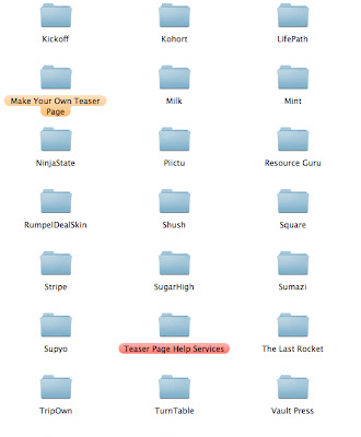
I organized the pages, taking pictures during each step of the process, and saved them to my hard drive:
 |
 |
| I included some folders for services that allow you to create your own teaser pages, like KickOffLabs, Launch Effect, and Launch Rock |
 |
| Services that can be useful for teaser page designers: MailChimp (email marketing and list manager), Olark (live chat and monitoring of your website visitors), etc... |
After going through dozens of these sites, I came to a certain realization: I prefer the simple, uncluttered ones the best.
 |
| Enter Cloudring, a service for managing your personal online information: note the simple, elegant teaser page UI design |
 |
| After inputting my email, a small, unobtrusive message pops up informing me that the beta is currently full |
 |
| Cloudring log-in page |
Another thing to consider are the stealth mode teaser pages, so named because they don't actually tell you about the startup's service/product.
TechCrunch has a great article about a stealth mode teaser page for the startup Hipster, titled "How a Startup Named Hipster Got 10k Signups in Two Days, Without Revealing What It Does" (http://techcrunch.com/2011/01/17/hipster-2/)
 |
| Hipster's hit stealth page, with the mysterious "Something Cool is Coming to San Francisco" in the title |
Another stealth teaser page made by the startup Lifepath was actually charging users $10 to create an account, without revealing what it was about:
 |
Eventually, I decided to choose the best teaser pages, and place them in their own folder.
But how do you define best where teaser pages are concerned?
I came to the conclusion that there were three different ways:
- Design (well designed teasers, all the way from the front page to social media interaction, emails, log-in pages, etc...)
- Function/Innovation (teasers that offer unique experiences or offerings, such as early access, sign-up discounts, interesting user forms, discounts, etc...)
- Mixture of Both
 |
| My best teaser folders, organized by Design, Function, and Both |
| Best by Design |
 |
| Forkly entered my Best by Function/Innovation list because of its popular viral invitation system |
 |
| After leaving your email... |
 |
| Dabble has so much to offer: an incredibly cool, interactive landing page.... |
 |
| ...an interesting user name competition, whereby the person who gets the most signups wins the right to use their chosen name (though they weren't the first to implement this kind of feature)... |
 |
| ...and an interesting stealth mode teaser video. |
Some other great teaser sites that have a great mixture of both function/innovation and design include Evertale (https://evertale.com/) and Sumazi (http://beta.sumazi.com/).
______________________
Using these teaser pages as an example, we have been hard at work creating our own.
Because we want Add2Paper's U.S. teaser page to be simple and direct, a stealth mode page is out of the question, especially because the service has already been running in Korea.
However, we now firmly believe that a proper mix of design and innovation is absolutely fundamental to the success of a teaser page.
It's all a question of finding that balance.


